Accessibility Guidelines
COMMVAULT DESIGN SYSTEM
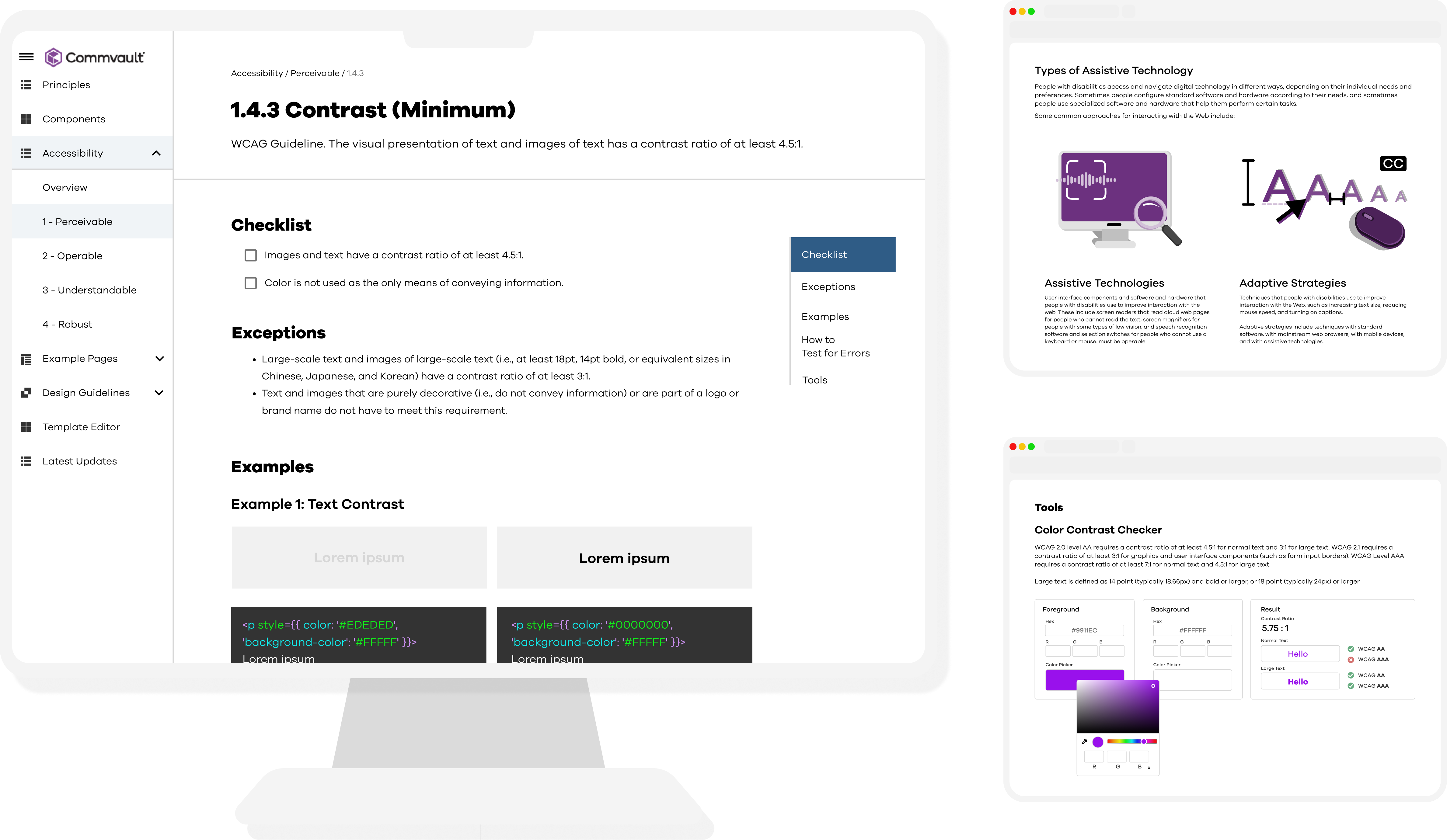

Commvault is the leading provider of data protection and management software applications related services. This past year, the UX team has taken the initiative to conduct assessments aimed at identifying areas where Commvault products need improvement to align with Web Content Accessibility Guidelines (WCAG), resulting in a list of 20+ areas requiring attention, each related to various web accessibility topics. Although developers were able to resolve most issues encountered, they lacked a centralized resource for addressing and preventing accessibility errors consistently.
My project focused on designing an accessibility section within the internal design system site. This section includes detailed guidance on WCAG, potential compliance issues faced by Commvault engineers, and effective solutions. As a UX Design Intern, I led research, design, and testing efforts for this initiative.
UI/UX Designer
Project Manager, Designers, Developers
6 months
Presented this project to a panel of 10 judges (Commvault employees from all departments) in a skit format and won 🥇1st Place (out of ~40 projects) in the Commvault intern project contest!! These screens are currently live and are being used by frontend developers currently addressing accessibility issues.
CV developers lack one central location for guidance on Accessibility Practices and Principles, resulting in significant development time being spent on researching these issues.
→ How do Commvault developers currently solve accessibility issues?
We wanted needed to address and optimize critical steps in their workflow:
We tried addressing one of these accessibility issues on our own and it took almost 3 hours to understand the issue itself! 😅
To begin, I did a comparative analysis to see what resources current Web Accessibility guides and websites contain. I examined 7 different accessibility-related websites (Apple, Google M2 and M3, Salesforce, Univ. of Washington, Section 508, WebAIM) to better understand what exactly what types of content would help a developer in solving accessibility issues.
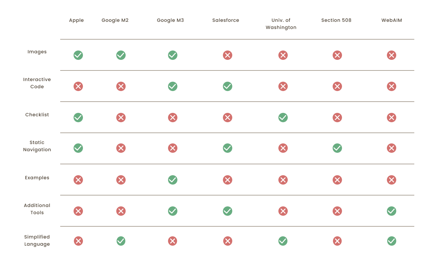
→ We discovered that including visuals, simplified language, strong navigation would be most helpful for developers. Time permitting, wanted to also include interactive coding elements.
Based on insights from our comparative analysis, we created information architecture and devised a flowchart to outline the necessary decisions and action to navigate the guidelines. I am unable to show images, but here are some key takeaways:
I used FigJam to create sketches (and later, Figma to create wireframes) that supported each of these main screens, aiming to follow the established design patterns while incorporating new accessibility-related elements.
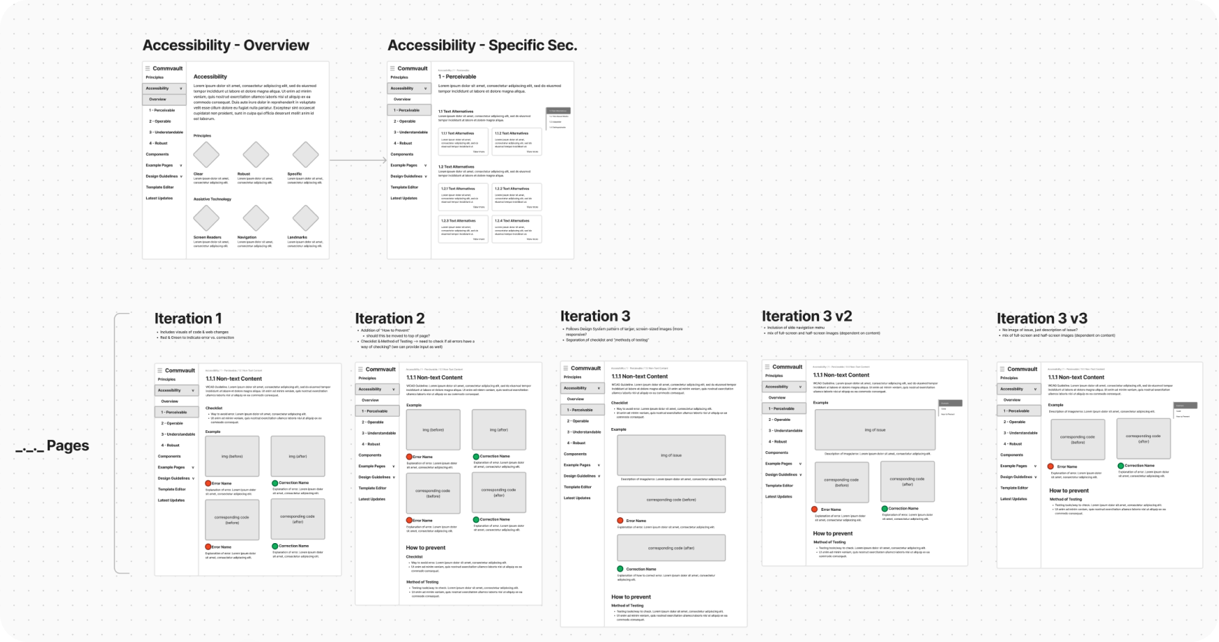
Every 2 weeks, I would have feedback sessions with my mentor and VP of UX Design, Parisa Bazl and share work with my fellow UX Development intern to ensure the project was feasible! I iterated through 3 rounds of wireframes before building them on Figma and on production.
For usability testing, we reached out to Commvault frontend developers that may encounter accessibility issues in their work. We created a two-part test with a navigational portion as well as comprehension tasks with hypothetical scenarios to gauge ease-of-use as well as applicability.
I led 2 rounds of user tests with 8 users to ensure our designs were solid. We used Microsoft Teams to facilitate these sessions.
I am unable to share any images from our testing sessions due to privacy reasons, but here are some highlights
Using existing components and creating roughly 10 of my own, I created 3 main page templates for the Accessibility guide: an overview page, and a principle & guideline template. I am only able to show certain parts of the project per privacy agreements.
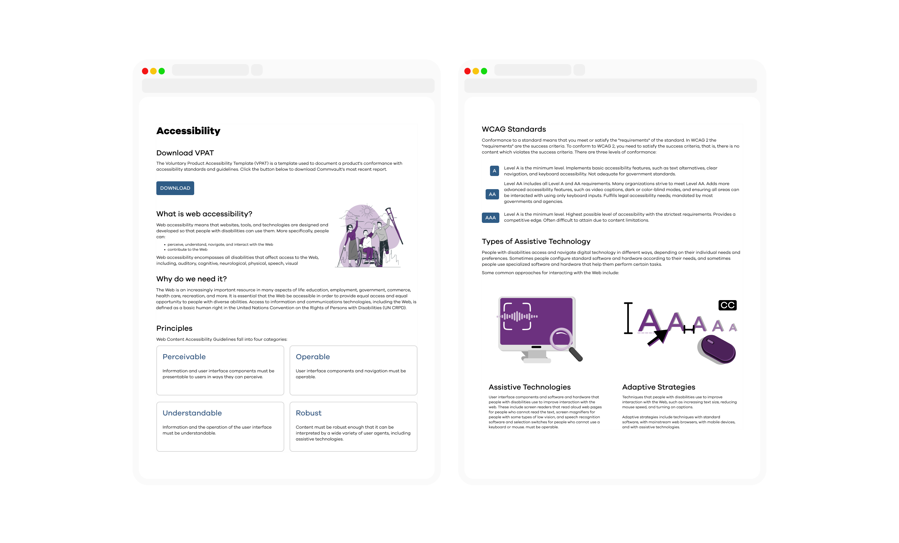
We created an overview landing page that covered all the basic aspects of accessibility: definitions, principles, levels, and technologies. From here, users can navigate to specific principle pages to find more specific guidelines. We have also provided links to official resources for users to reference.
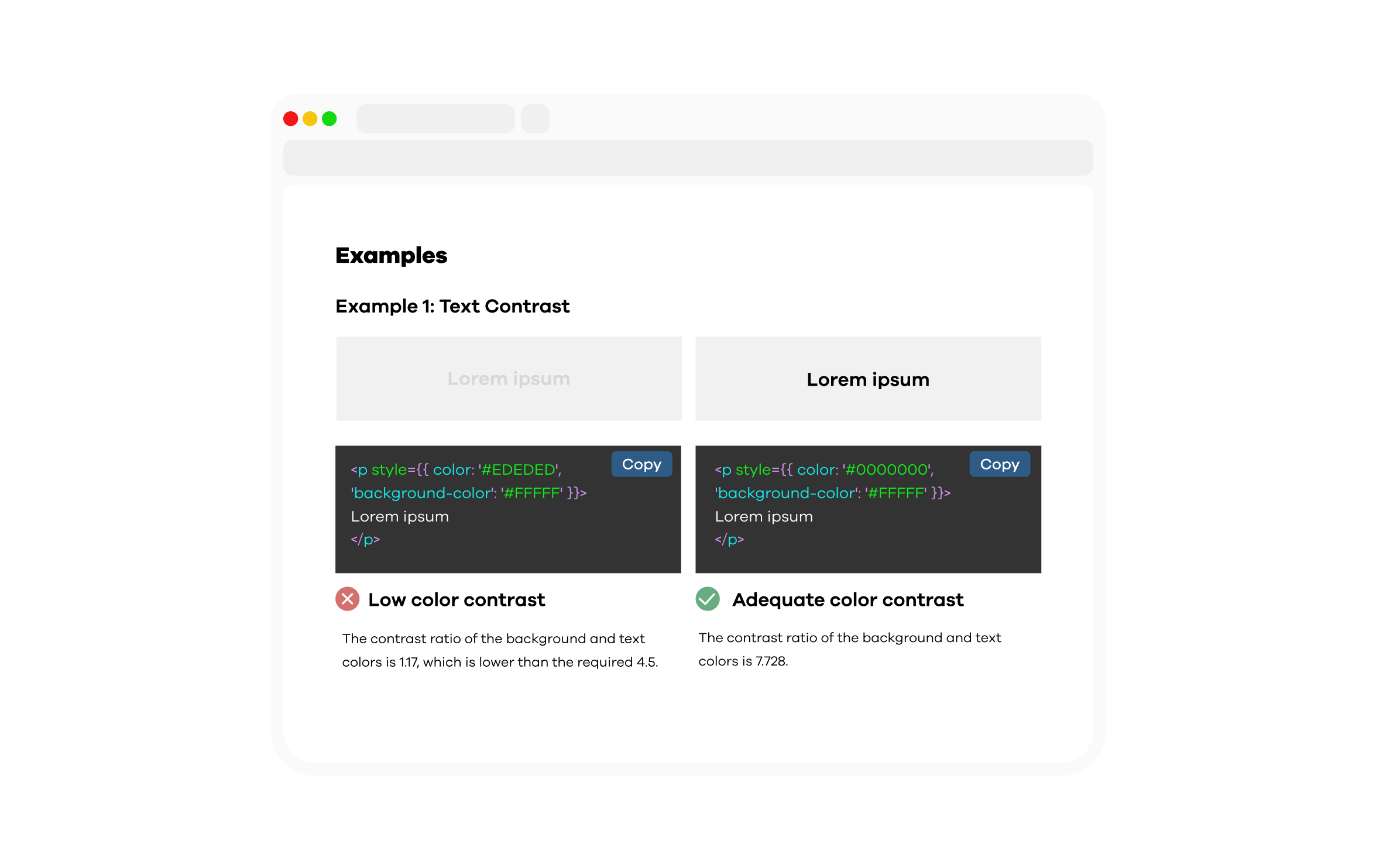
To help provide more guidance on certain WCAG issues and their criteria, we created editable live-updating code examples (if applicable), and tips for testing accessibility. These examples have similar components and structure to Commvault elements.
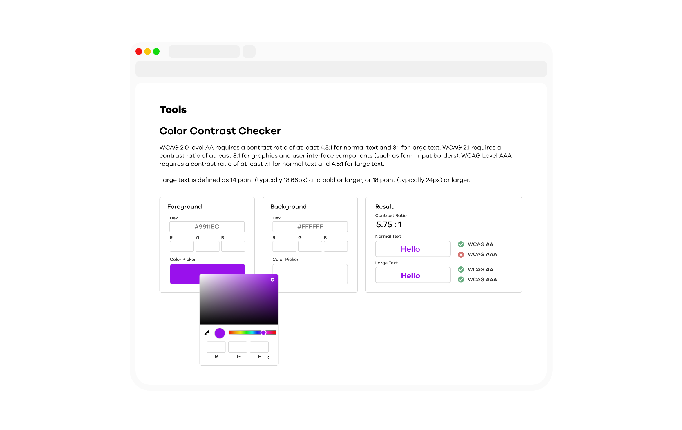
For some principles, we built in-site accessibility checker tools for users to interact with. For example, a color-contrast checker allows users to input colors, determine if the contrast ratio is high enough, and identify which WCAG levels it meets.
I am incredibly grateful for Commvault for this internship opportunity and want to give a special thanks to my UX Development intern, Spencer Lyudovyk, and my manager Parisa Bazl. This project has greatly deepened my understanding of accessibility and completely reshaped how I incorporate it into my designs. I am excited to see how Commvault’s Design department continues to lead a more accessible future!