AMP Park App
PARKING PAYMENTS
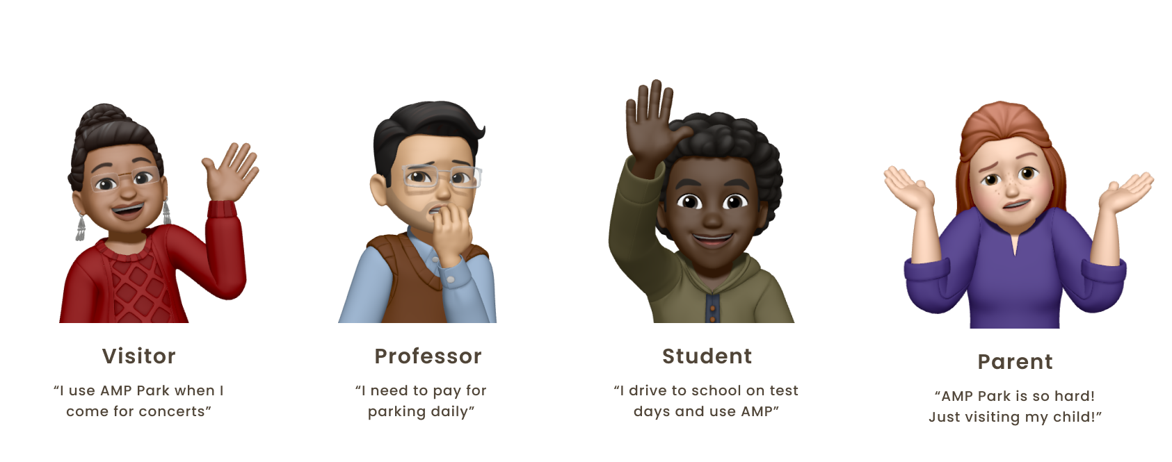
Nobody likes parking somewhere new – it can be costly, have complex regulations, not enough parking spots, and everywhere seems to have a different “app”. This past year, UC Davis Transportation and Parking Services shifted from the popular parking app ParkMobile to AMP Park for numerous reasons, but mostly to improve the parking experience for the campus community; however, due to a number of usability issues, it is sufficient to say the app has not been a hit among users (in fact, there is a large Reddit page critisizing the app 😬). UC Davis is not AMP Park’s only client, so we wanted to ensure scalability while designing. As a Product Designer, I was in charge of researching and revamping profile features of the AMP Park app to help users feel more secure in managing parking, payments, and privacy.
Product Designer
Marketing Manager, Product Designers, Developers
2 months
Users feel insecure managing parking, payment, and privacy on the AMP Park app due to limited customization, a poor UI, and unclear user flows.
→ UC Davis has people coming to campus for a multitude of reasons everyday. How might we improve the parking payment process for all of these individuals?
Aside from paying for parking (and parking tickets), we wanted to get to know the pain points of AMP Park users with varying levels of familiarity (students, faculty, staff, visitors, etc.). We used 3 primary methods to conduct user research: a competitive analysis of similar apps, conducted interviews with individuals and focus groups, and tested the AMP app with users to identify pain points. I specifically focused on people’s interactions with their profile and payments.
Some common themes we identified were users wanting more flexibility and personalization, and had great feelings of mistrust using the app in many regards:
→ How can we bring attention to user features, and refresh interfaces to improve accessibility and improve overall experience?
To begin, I examined the current flows for how users pay for parking and manage their profile settings.
For first-time users or users who do not save anything within the app, the payment process can be exceptionally difficult. Users will have to exit out of the payment screen at multiple times to go to their profile and update their settings before beign able to complete their payment.
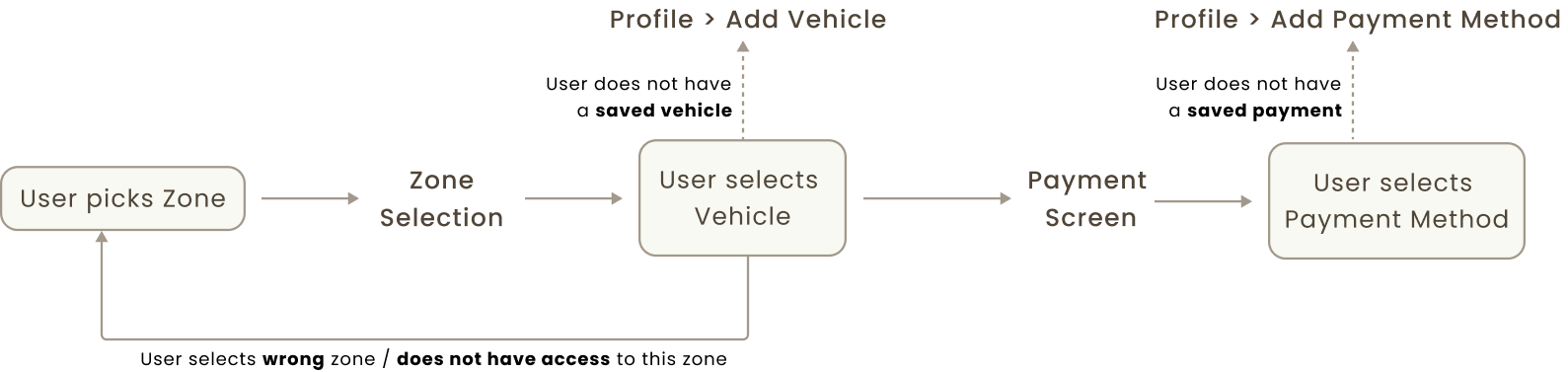
→ How might we streamline this process to reduce the number of screens and decrease transaction time?
The profile settings are listed on a side-menu on the home page; however, the settings within the menu are very confusing and users had difficulty finding the correct pages with the settings they need. Furthermore, users expressed feelings of discomfort saving their information in the clunky UI.
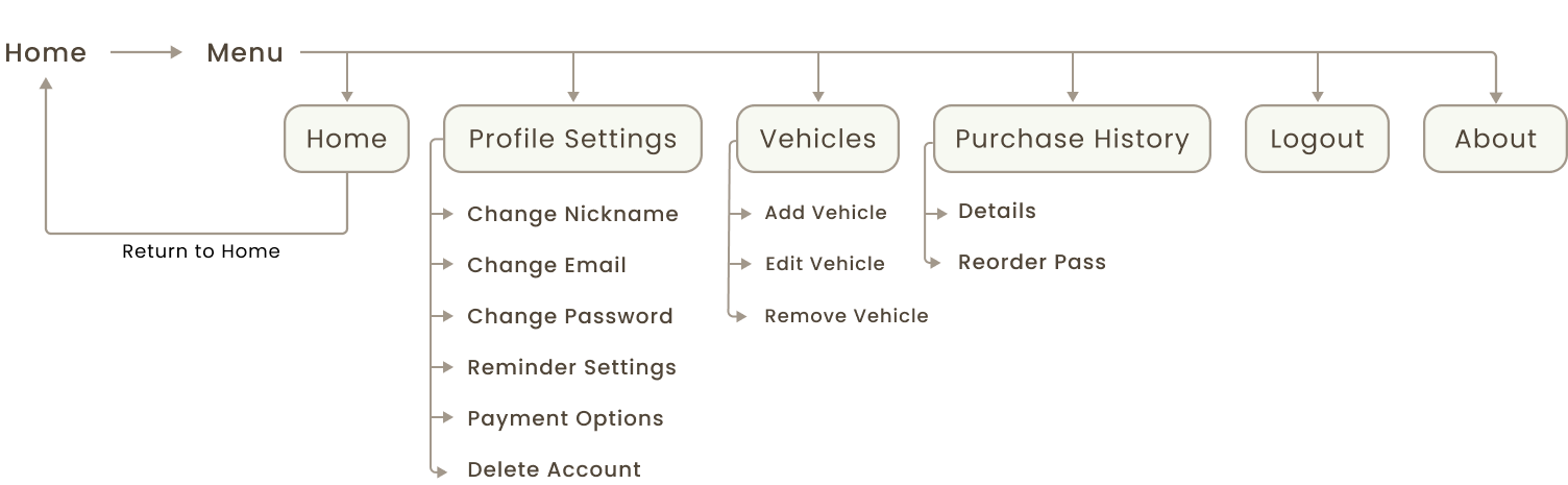
→ How might we reorganize settings so users can easily adjust their settings and feel more comfortable storing their information in the app?
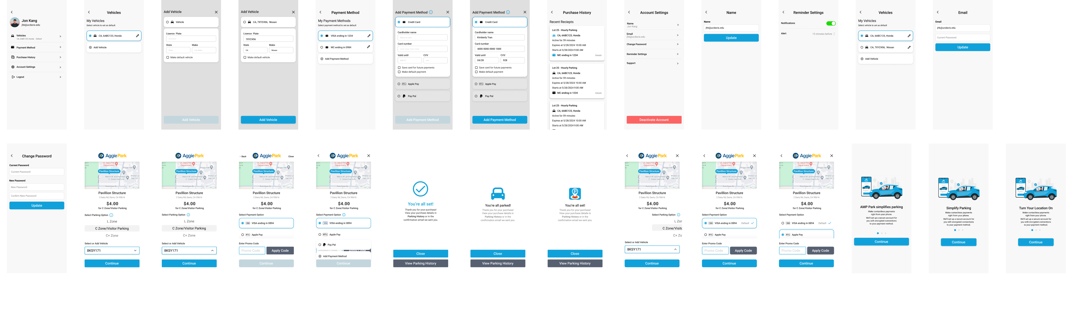
Due to the quick turn around time of the project, we quickly moved to Figma to build our ideas. We aimed to incorporate more personalization features (such as default vehicles payment methods) as well as improvements to design components and user feedback patterns. Below are some of our wireframes:
Given that much of the 🐄 UC Davis community percieves UC Davis Transportation Department as Public Enemy #1, much of this project was classified at the time to prevent the spread misinformation, and we did not want to guarantee these changes without AMP Park's input and approval.
→ Consequenetly, we conducted usability testing on a small scale with UC Davis Transportation Department staff and panel. Here is some feedback we received:
Following this, we implemented necessary changes and created our final designs as follows.
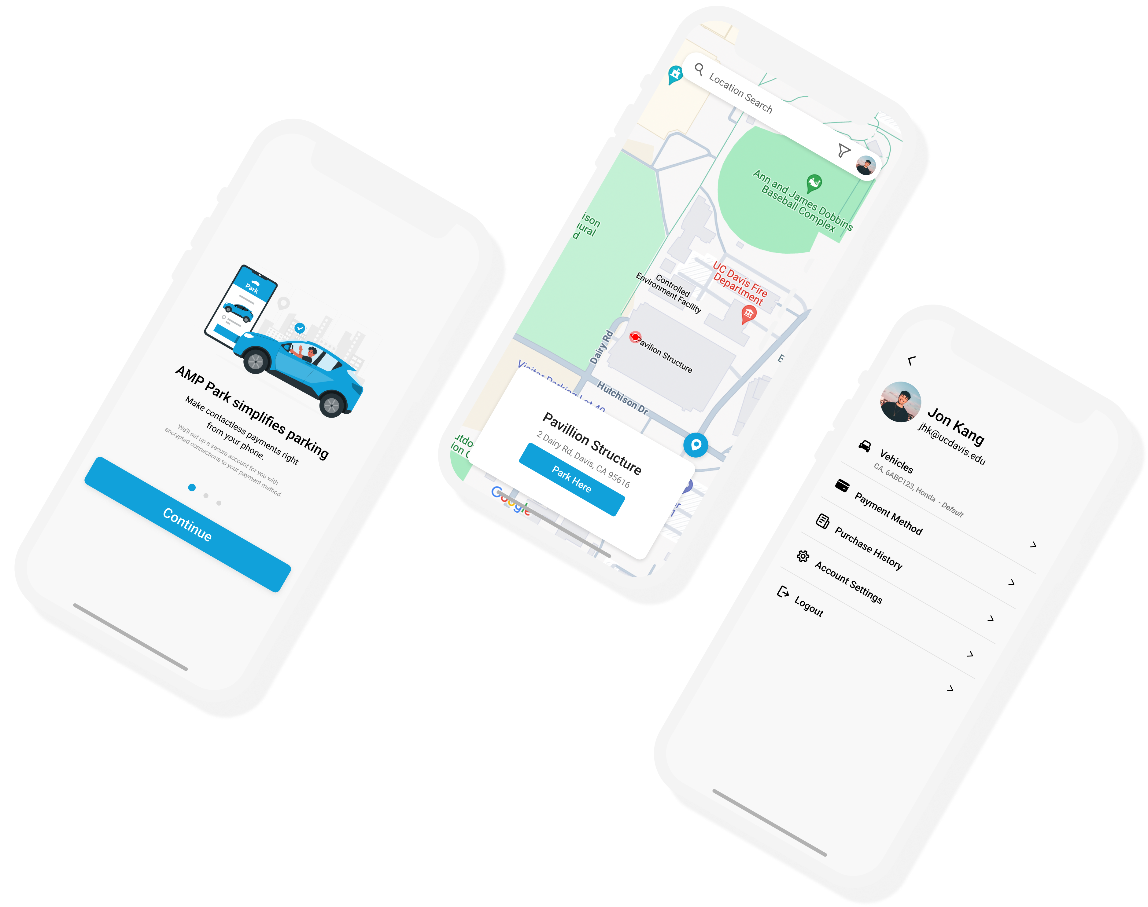
In order to maintain the familiarity and trust users already established with the app, I made sure I did not make any stark or unnecessary changes to AMP’s existing design system in our final designs. Here are our proposed wireframes aimed improve accessibility and increase feelings of credibility.
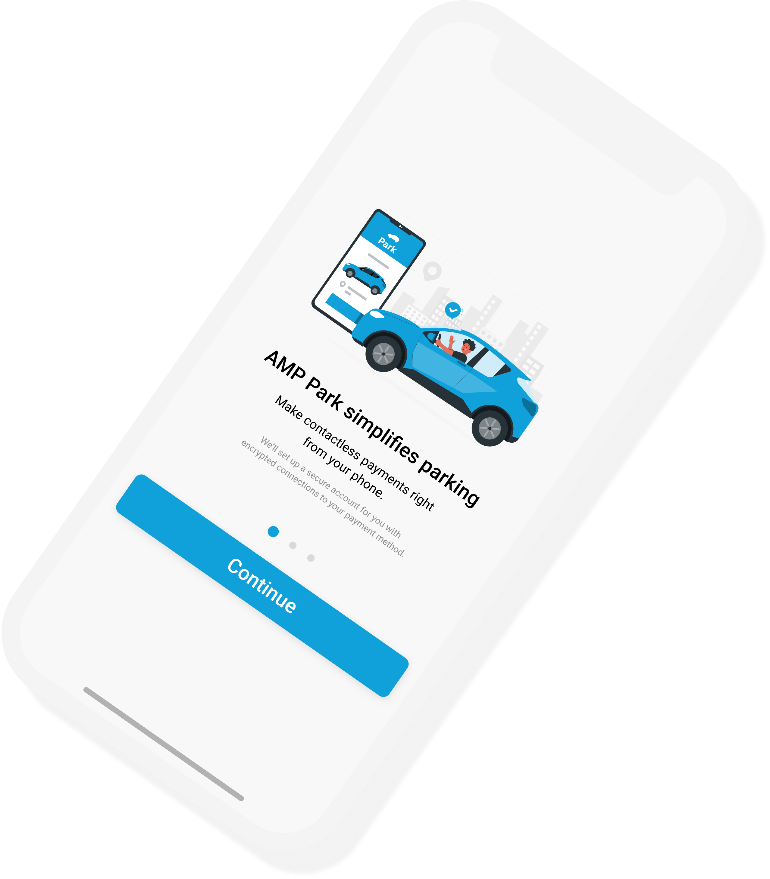
Users are provided 3 screens of onboarding: an introduction to AMP Park, assurances of security, and instructions to turn on location services. Our goal in creating these screens was to reduce the amount of errors by providing tips that often resolve these issues. Furthermore, we wanted to add a layer of security for users by verifying that AMP Park is a reliable and trustworthy app.
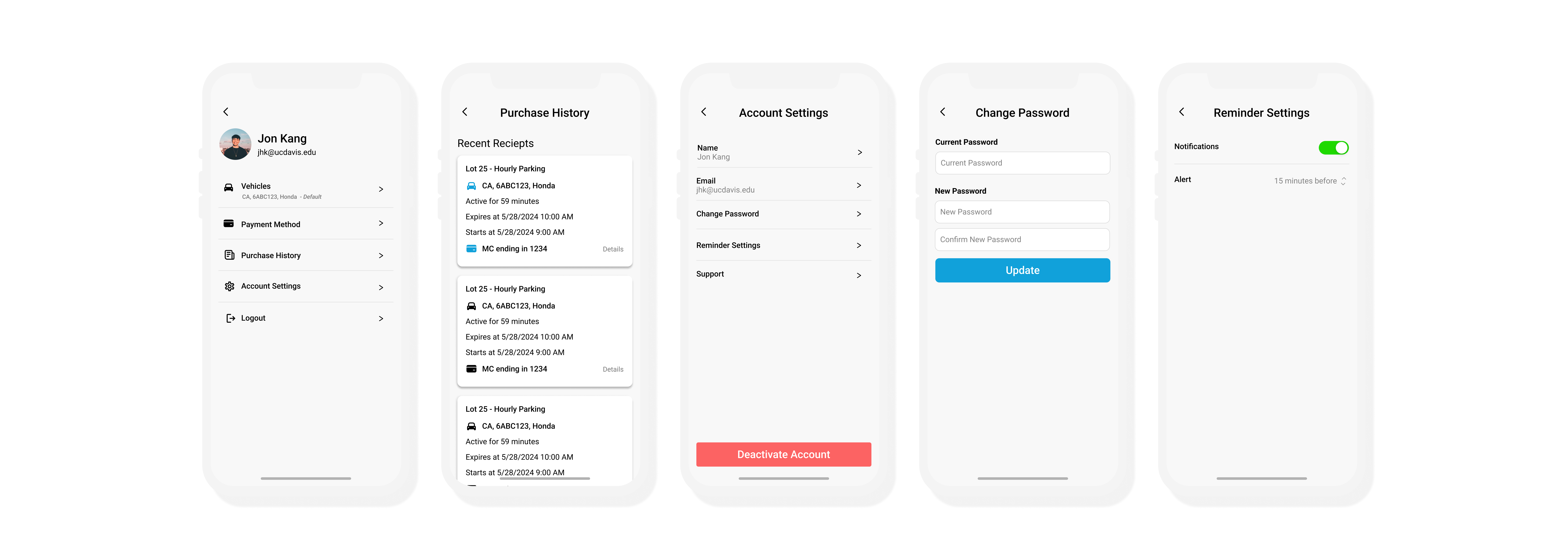
To provide users with a greater sense of autonomy over their personal information, I decided to reorganize the profile information into one central location to reduce in-app navigation struggles. I aimed to use more common design patterns to help users feel more secure about their information being saved on the app. I suggested we add icons for clarity, as well as utilize elements like cards to help separate information into logical groupings.
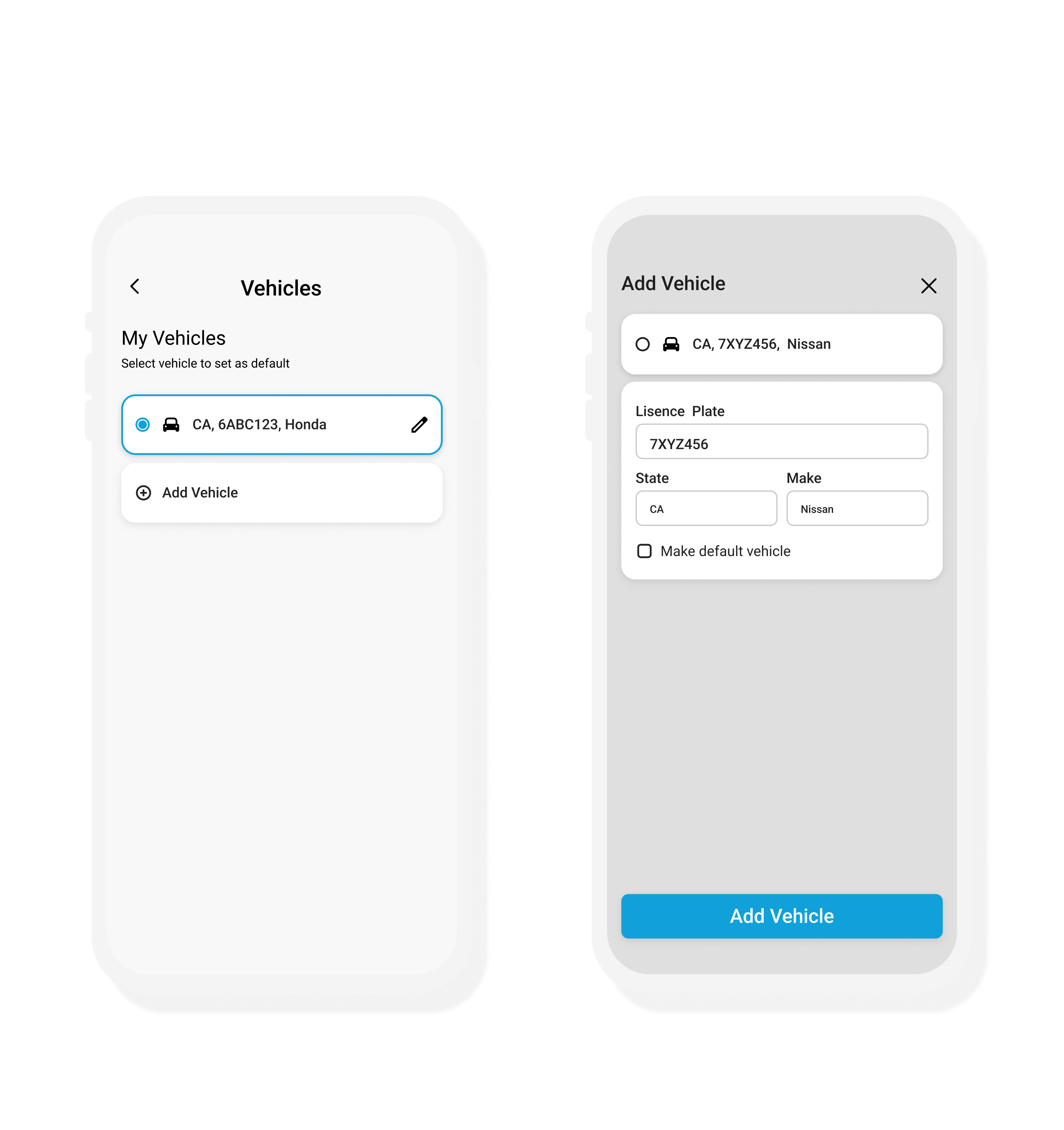
We streamlined the process for editing and adding a vehicle. Currently, users can enter their information at multiple points in the app, but the entry forms lack consistency. In our proposed designs, we have created new forms for users to enter their vehicle information. Furhtermore, since many users expressed a desire to set a default vehicle, we provided an option for users to select as follows.
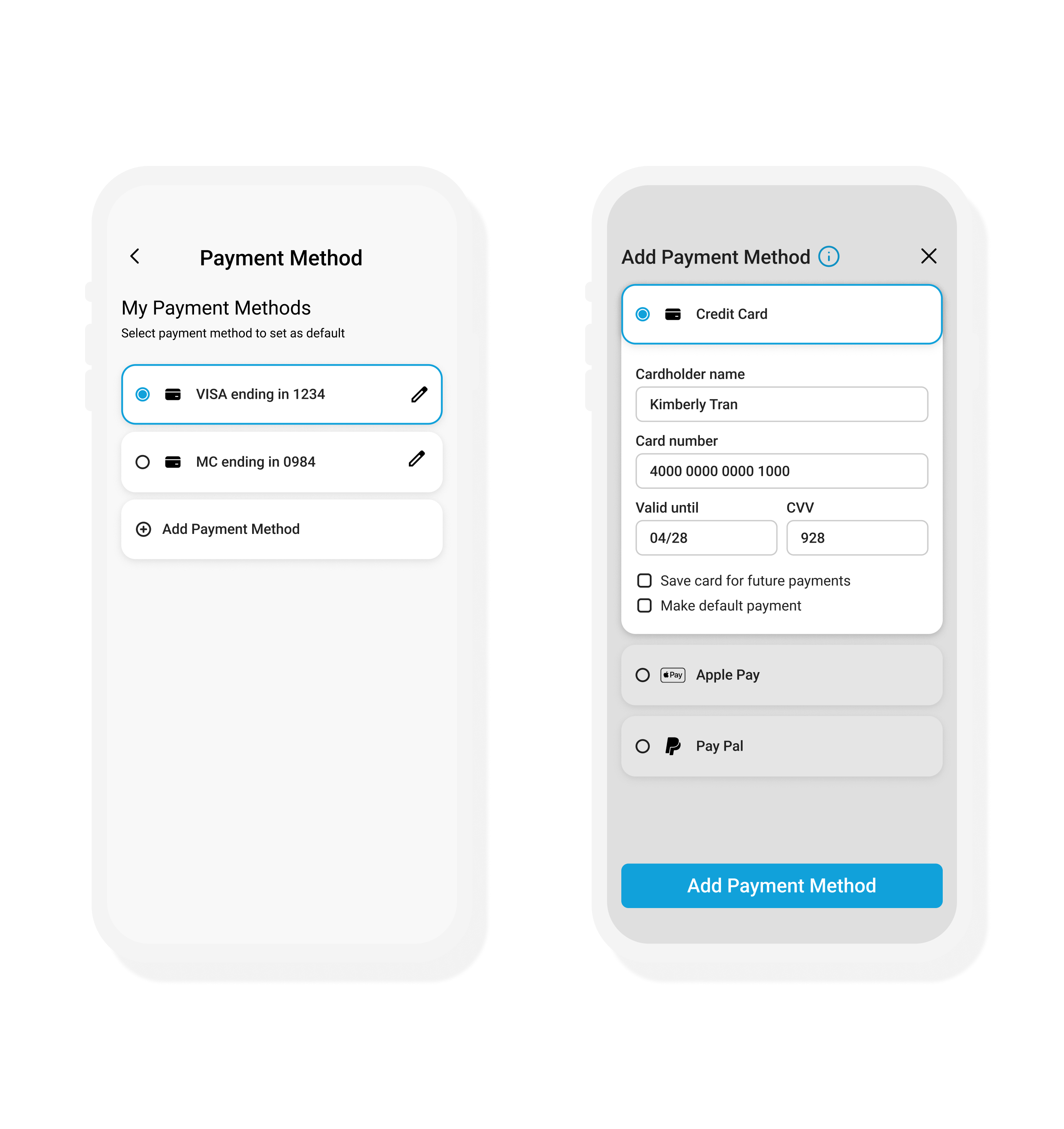
The proposed payment process will follow a similar format to the "Add Vehicle" flow, and will also have the "default" setting to make payments easier. We propose that in addition to these changes, AMP Park implement additional payment methods such as PayPal, ApplePay, Venmo, etc. so users are able to make payments quicker through a trusted payment method.
We were forutnate enough to be able to work directly with the developers of AMP Park to try and implement these features to improve the parking experience. While it may be a bit longer till we see the larger UI changes, certain aspects of profile and payment flow have been revamped per my suggestions. We look forward to hearing feedback via the annual UC Davis Transportation Services Feedback Survey.
For future iterations, it would be nice to further refine the UI and try to include new design patterns. Additionally, we would like to continue experimenting with design system changes such as colors and typography. I am continuing as a product designer for the department into the next academic year and look forward to exploring more of the parking-space problem-space 🅿️!